V I E T N A M R E S T A U R A N T
Viet Nam is a genuine Vietnamese restaurant located in the heart of El Barrio de las Letras, one of the most iconic quarters of Madrid.
This is a re-brading focused on enhance the authentic, every day beauty of Vietnamese street life and its powerful connection with food.
P R E V I O U S I M A G E

R E B R A N D
D E S I G N E L E M E N T S
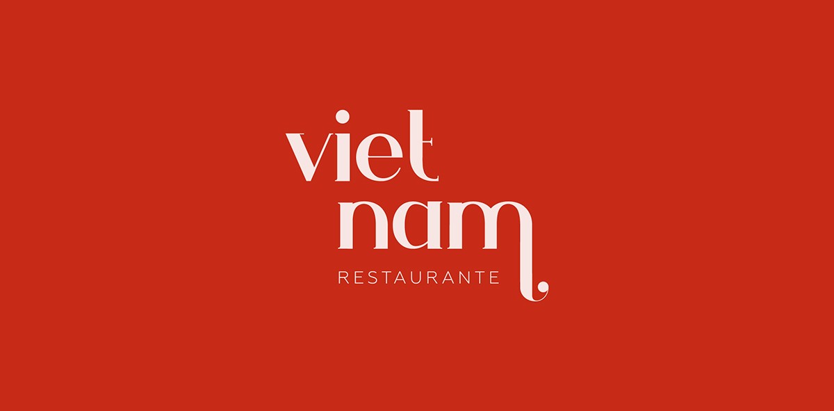
The main font of this typographic logo is Ginva, an evocative typeface arranged to achieve a minimal and clean appearance.
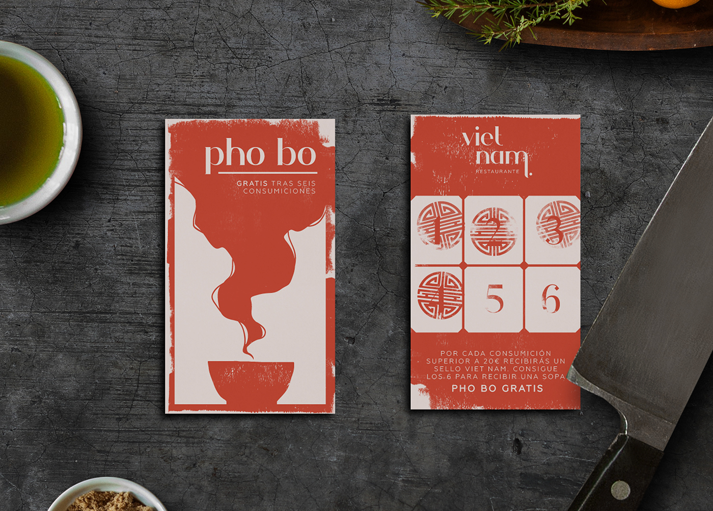
The color palette swings from vivid red to pastel pink. Red shade was chosen because of its traditional Vietnamese meaning
of happiness, good luck and celebration while pastel pink provides a soft base for the design to bloom.


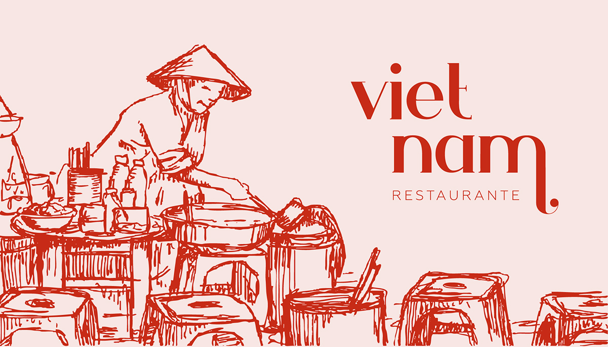
I L L U S T R A T I O N S
Illustration´s style simulates a travel sketch book, with quick and loose strokes,
emphasizing the dynamic, ever changing nature of Vietnamese streets.


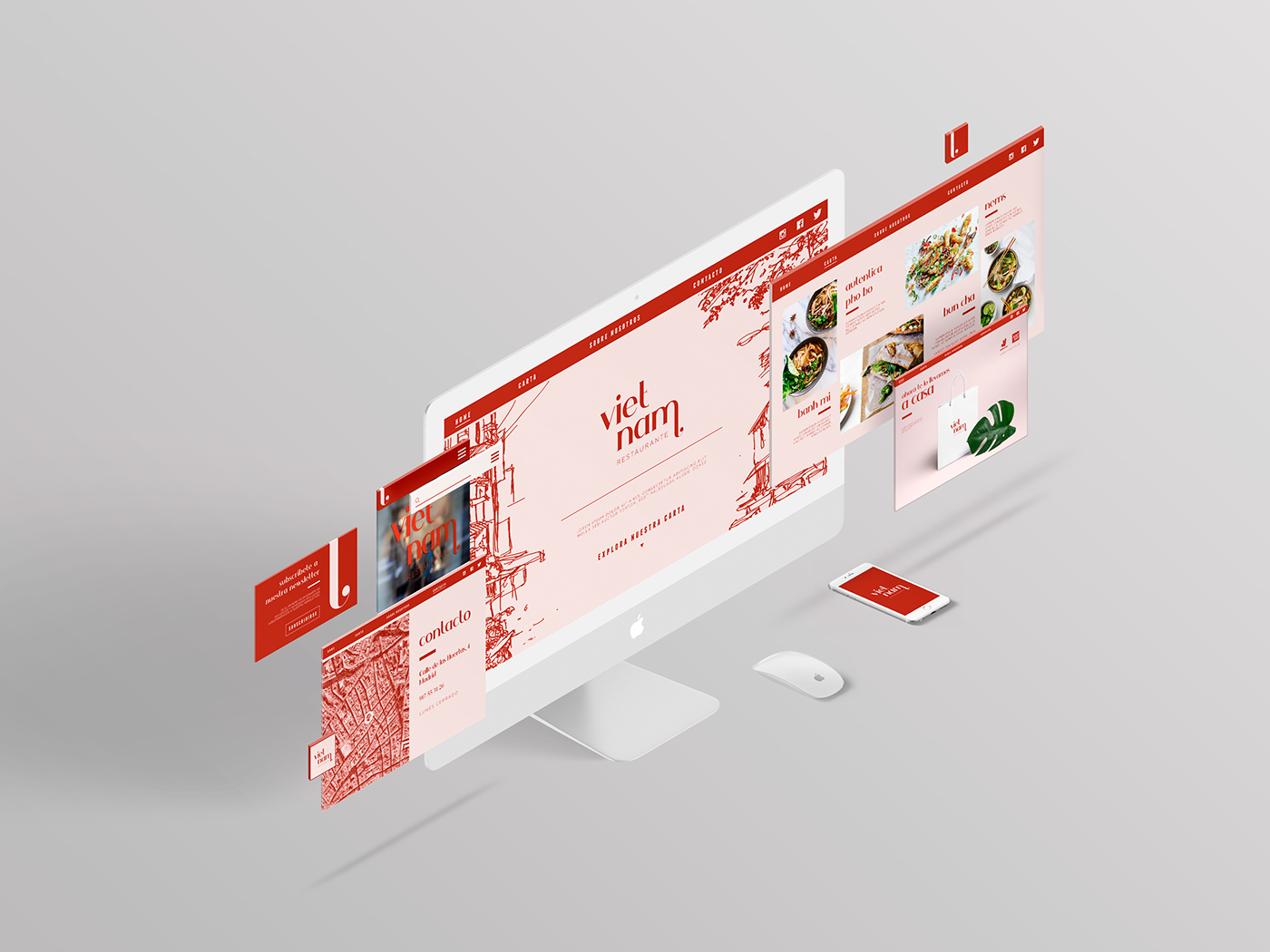
W E B D E S I G N
Web design keeps the brand color palette and typographic combinations,
including some characteristic illustrations in a clean, easy to navigate layout.